JCU Welcomes Professor Tamara Mchedlidze for the Digital Humanities in Practice Lecture Series
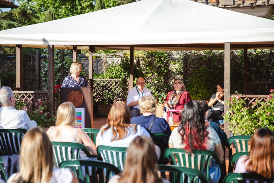
The JCU Department of English Language and Literature, and the Department of Mathematics, Natural, and Applied Sciences welcomed Professor Tamara Mchedlidze of the Department of Information and Computing Sciences at Utrecht University for a talk on “European Values Maps Visualization of Large Opinion Spaces” on March 30, 2023.
The talk, which was the third in the “DH@JCU2023 – Digital Humanities in Practice” lecture series, was moderated by computer science professor Patrizio Angelini and showed how a computer scientist understands and addresses a human sciences question.

Digital Humanities
Professor Mchedlidze specializes in visualizations and brought as an example of her work the project in collaboration with the Department of Sociology at Tilburg University to build the European Values Maps. As she explained, “In this talk, I will present the methodology of the EVM project and invite you to reflect together on how data visualization methods can influence opinion polarization on societal topics.”
There are many sociological surveys with the object of charting the changing values of given communities, and Professor Mchedlidze provided examples such as the International Social Survey Program or the World Values Survey. The main goal of the European Values Study (EVS) she cooperates with is a large-scale, cross-national, repeated survey on basic human values, the object of which is to “understand the spread of values across Europe,” and to establish the extent to which the people of the European Union share common core values. The study is performed through ongoing surveys, and examples of typical questions provided by Professor Mchedlidze are “What is your stance towards gender equality? What do you think about environmental protection? How much do you trust societal organizations such as the government and media? How are your private moral principles?”
Professor Mchedlidze’s project, European Value Maps (EVM), applies data analysis and visualization techniques to the EVS data to construct conceptual maps of Europe. As she explained, “maps resemble geographic maps, and therefore look more familiar to the viewers than other abstract types of data visualizations, relying on the human familiarity with geographic maps. In these visualizations, countries represent groups of people holding similar opinions on human values.”
Professor Mchedlidze proceeded to illustrate various types of visualization commonly used and to comment on their comparative effectiveness and readability. However, Professor Mchedlidze pointed out that the most used line-charts and scatterplot visualizations only “allow addressing one or two dimensions at a time, and do not answer questions on how people group in their opinions on certain topics.” The research questions Professor Mchedlidze wanted to address included whether it would be possible to discover more in the EVS data by applying state-of-the-art data analysis and visualization methods and which visualization styles are suitable for presenting the findings to the general public.
Professor Mchedlidze proceeded to demonstrate the various stages of development of the visualization project and the reflection guiding it, showing the method of procedure and the specific systems employed, such as the t-distributed stochastic neighbor embedding (t-SNE) method, the clustering method, and the Voronoi diagram.
In conclusion, Professor Mchedlidze showed a past project that her group had realized on eating habits in Europe using dynamic maps, and the way in which visualization might change in real-time as old opinions were removed, new opinions were added, or new clusters were introduced. Using dynamic maps, it is possible to ensure that “dynamic changes in the graph are mapped to dynamic changes in the map and to provide dynamic stability: each dynamic step implements a small change to the graph to ensure dynamic stability and force-directed algorithm allows easy integration of small changes into layout preserving stability.” Most interestingly, Professor Mchedlidze showed the mathematical structure that supports the visualizations. While these formulas were beyond the understanding of many in the audience, it was very useful to see how the algorithms are underpinning the visualization.
This talk showed the complexity of the technical processes through which humanistic questions can be addressed through digital visualization, introducing the audience to the perspective of the computer scientist.